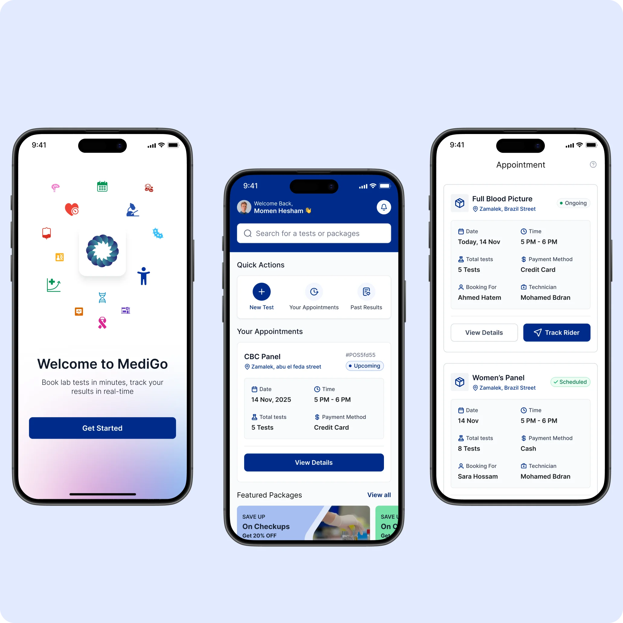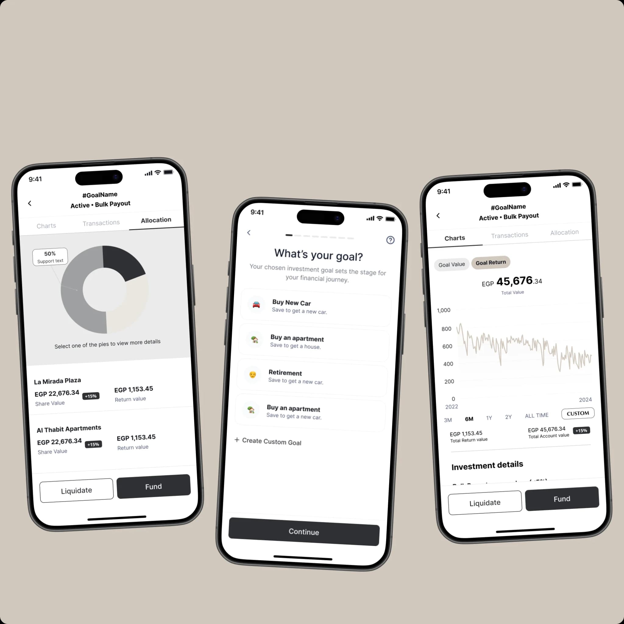
Motion is a tool, not a flourish. Done right, it teaches the product to your user. Done wrong, it makes them work harder to ignore it.
§The Function-First Test
Before adding any animation, we ask one question: what does this motion explain? If the answer is 'nothing — it just looks nice,' we cut it. Decoration without function is friction with extra steps.
§Three Roles for Motion
- Spatial — 'this came from there.' Cards fly in from the edge they belong to.
- Temporal — 'wait, something happened.' Loading states, confirmations, state changes.
- Emotional — 'this matters.' Celebration on success, gentle weight on errors.
Animation is invisible when it's working. The user just understands what happened.
§Durations We Live By
Most motion problems are timing problems. We aim for 150ms on hovers, 250ms on transitions between same-screen states, and 400ms when a new context arrives. Past 500ms, the user starts noticing the animation instead of the result.
§Easing Is Where the Personality Lives
A button can ease-out like a confident closer or spring like an enthusiastic golden retriever. Same component, two different products. We tune easing curves to the brand before we tune them to the gesture.
§When to Skip It Entirely
Motion is expensive — cognitively for the user, computationally for the device. We turn off most motion when prefers-reduced-motion is set, and we ship without animation entirely in dense data UIs where the user is scanning, not reading. The right amount of motion is sometimes none.